This page is included with our Custom Theme and Fancy design options. It anchors our overall unique-to-you design choices. Part of beauty is consistency. It represents all the global, or consistent, design elements and choices used in the design of your website. Compare this approach to our Theme Starter option where we just look at other pages of the website and strive for consistency.
*** Design Elements ***
(Until Elementor implements global styles for elements, copy styles from this page.)
Particle + divider
Use the full-width particle plus our gray divider to separate top pricing info from detailed info–and pages like that.
Fancy in-page section header (for simple use H1 or H3)
Tech Example In-Page Full-Width Header
The only difference is that full-width separator is width=100%, colum=90%.
-
Computer Checkup FREE
(KB102220) Always FREE! We tell you what's next! Our 8 point checkup includes virus check, appropriate tools check, Win Updates audit, service pack check, Device Manager audit, Event Logs audit, HD Space Check, and our pro recommendations as to what upgrades are available! You can do the work, or let us help you.
-
Advanced Tune-Up (Deep Virus Removal) $225
IN SHOP ONLY! Same as Tune-Up plus deep virus Scans+Removal (runs overnight), RAM test, HD test, Pro Defrag, apply all Win Updates, advanced HD file clean, and advanced Registry Clean. This procedure can be destructive to data. PLEASE make sure your data is backed up prior to engaging this service.
-
Format Reinstall $165
(KB102221) IN SHOP ONLY! Bring your computer as close as possible back to a new state ready for you to install applications, setup the internet, email, printers, etc. Can include upgrading to a new OS version. Scope is defined as latest service pack then 1 layer of Win updates, and compatible hardware drivers. Although the client is responsible for product keys, this service does include product key retrieval attempt using our advanced key retrieval tools. Does not include software installs, nor new computer setup (internet, printing, and email), nor data transfer. All available upon request.
-
Data Transfer $165
(KB102218) IN SHOP ONLY! Options, relocate old HD in new computer, or move the data from one device to another. When moving data, you image the old HD or just move specific data. If moving specific data, list out what you moved for the client so they can sign off that it is all data. Optional image drive first for $25 (KB102276).
Particle background…
Business Hosting
cPanel control panel on Linux with dedicated resources (not shared).
Virtual Private Server
cPanel control panel on a dedicated virtual private Linux server with full root access.
Dedicated Server
Dedicated Linux or Windows server with full access to your single-tenant VM.
Download PDF style…
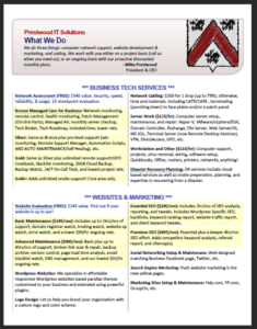
What We Do Flyer
We do three things: computer network support, website development & marketing, and coding. We work with you either on a project basis (call us when you need us), or an ongoing basis with our proactive discounted monthly plans.
Call-to-action “Hero” section example:
FREE 30 day trial!
Try our service for free for 30 days, free setup too!
To qualify, simply fill out this form and we’ll email you a coupon and all the details today.
Icons
Icon Box
This is the heading
Click edit button to change this text. Lorem ipsum dolor sit amet, consectetur adipiscing elit. Ut elit tellus, luctus nec ullamcorper mattis, pulvinar dapibus leo.
Section or area first title underlined text.
Regular underlined text.
Duel Color Header: H3, gradient
Header Before Highlight and after!
UAE Fancy Heading: H3, line icon
Design is a funny word
Typography
Set in Appearance > Customizer > Typography > Base Typography. A common approach is to use a Sans Serif / Serif for contrast. Sans Serif is generally considered more modern than Serif. One approach is to use Serif fonts only with traditional industries such as law firms, journalism, etc. and only Sans Serif for modern industries. Personally I like to use Serif for headers and Sans Serif for body text, or Sans Serif for both.
- Headers & Title: Merriweather
- Content & Body: Merriweather Sans
- H2 Highlight Font: not used (same font as other headings).
Heading 1: abc, ABC, 123, link, bold, italic, bold/italic, underline
In general, Heading 1 is for page titles, and major sections of pages.
Next Paragraph: The gap between paragraph lines and paragraphs is also part of typography. For ease of reading, we try to avoid long sentences by arranging page layout to favor text that ranges from 30 to 90 characters wide.
Text, abc, ABC, 123, link, ! @ # % $, bold, italic, bold & italic, underline. The quick brown fox jumps over the lazy dog!
Heading 2: Highlight Font, abc, ABC, 123, link, bold, italic, bold/italic, underline
Heading 2 is generally skipped over except with our Fancy design where it is used as a highlight font.
Heading 3: abc, ABC, 123, link, bold, italic, bold/italic, underline
Heading 3 is the primary heading for page sections. In fact, I usually have many pages and posts that use ONLY body text with no, or a few H3 headings. Although you should break up text using headers, not every page works with lots of levels. Simple is usually better.
Heading 4: abc, ABC, 123, link, bold, italic, bold/italic, underline
Heading 4 is the header for sub-sections of a section in a page.
Bold-Text-Only Sub-Header
Instead of using H5 and H6 below H4, my style is to use plain text bold header in their place. Optionally, I like to define H5 and H6 the same “size” as body text.
Bold-Text-Only Soft-Return Example
I actually have two styles of this, one with a hard return like above. And a soft return, Shift+Return, like this example here. Whichever I go with, I try to be consistent within the page or post itself.
Indented: This is what indented text looks like.
Numbered list example:
- one
- two
- three
Preformatted text example
“Block quote example.”
Colors
(This chart is included only with our Fancy design option.)
{ color: #FAE6E4 }
.Terracotta
{ color: #E3695D }
{ color: #AE1000 }
{ color: #641912 }
{ color: #380E0A }
{color: #779E20 }
Web Page Flowchart
(This chart is included only with our Fancy design option.)